Whirly Blooms Dressed in Brilliance AND Floret
Posted by Gerri Robinson on
When I designed Floret over a year ago, I wanted to include the colors and tones I typically design in but also include colors and tones for the "future" .
I've always enjoyed REFRESHING my existing designs in my latest collection but I wanted to have a little fun and REFRESH Whirly Blooms in BOTH Brilliance AND Flutter. Want to see how well everyone plays together?

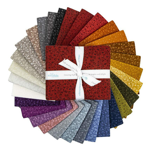
The above Whirly Blooms showcases the Brilliance prints as the "whirly" and the "whirly" backgrounds are the "darker" Floret prints PLUS my NEW Floret colors of Blue, Fuchsia, Jade, Teal and Turquois.

We "lightened" Whirly Blooms up a bit (above) with a different assortment of Brilliance prints and "lighter" Floret colors. Can you see the difference?
Do you have a preference of dark or light? Just about the time I lean toward the dark version, the light version catches my eye and I get conflicted.
Either way, you will NOT go wrong if you stitch up a "dark" or "light" REFRESHED Whirly Blooms in Brilliance AND Floret!
Here are all the quick links to Whirly Blooms here, Brilliance fabrics here, and Floret fabrics here.
Happy Quilting!
Gerri